Five essential web and email writing tips for nonwriters 31 Dec 2018 9:14 AM (6 years ago)

Photo by Ilya Pavlov on Unsplash
Five essential web and email writing tips for nonwriters
Maybe you realize that your business marketing and communications need to be better written, but you can’t afford a copywriter or communications staff. And perhaps you’re not confident about writing it yourself. Now what?
Here are five fundamental tips for non-writers to help make their writing cleaner and more effective.
1. Less is more
Your web and email copy compete with countless other distractions — Facebook, Twitter, Instagram, Amazon.com, dozens of other emails — so never assume that anyone looking at your content will patiently savor and read everything you write. The typical website visitor comes and goes in fewer than 12 seconds. Most users won’t open your emails, and those who do will rarely read them in full. The majority of people who do visit your website or open your emails will do it on mobile devices, so they may be on the go, or skimming it on a small screen.
All of that means that your chance to grab their attention is shorter and smaller than you might hope.
If you take away nothing else from this article, make it this: always strive to keep your content short, focused, and clear. Every word counts.
What’s a good email length? No hard rules, but anything over 200 words in an email is probably pushing the limits. Few emails can keep the attention of a typical user for more than a minute. Homepage copy length is more flexible, but a homepage should avoid long stretches of text. 150 words maximum is a safe rule of thumb. Save longer content for other pages on your website.
2. Avoid “throat clearing”
Don’t waste any first paragraph with a slow introduction to what you have to say. Don’t start with vague, general statements about business, your industry, or sweeping trends.
Always make sure your opening line is engaging and focused. Most people won’t get past your first sentences or two; so deliver key ideas there. Tell them what you do, what you offer, or how you can help them.
Quite often, after you write a first draft of anything, you’ll discover that the first line isn’t that useful. The second sentence is often where the good stuff starts. So do your reader a favor and get rid of that flabby first bit and get right into the meaningful ideas.
3. Big, complex words are usually the wrong ones
Big words don’t impress anyone. Don’t use “business-speak.” Use simple, clear language.
Write “use,” not “utilize.”
Write “think,” not “ideate.”
Write “clarify,” not “disambiguate.”
Write “do,” not “execute.”
Write “motivate,” not “incentivize.”
Need more examples? Check out this list of 150 “business jargon fixes” by Straight North.
4. When in doubt, avoid adjectives
As you likely remember from grade school, adjectives modify nouns. Sometimes they can be specific, like “red” or “warm” or “legal.” Those are fine. But often in business writing, we find fuzzy, subjective, or self-serving adjectives, like “unique” or “special” or “amazing.” In almost all cases, you should cut them. That may sound extreme, but in marketing writing, most often, adjectives come across as phony.
For example, here are some bad uses of adjectives:
- “We provide an incredible tool to help you lose 30 pounds right away!”
- “Our innovative, bleeding-edge application will save you hours of time every week.”
- “Datafloss Incorporated’s patented, powerful, and pathbreaking tax software will help you file your taxes accurately and on-time.”
Those self-congratulatory adjectives aren’t wowing anybody. If anything, it makes you less believable or authentic It’s better and more effective to just write:
- “Our tool will help you lose 30 pounds.”
- “Our application will save you hours every week.”
- “Our software will help you file your taxes accurately and on-time.”
What are exceptions to this rule? It’s fine to use adjectives that add actual useful and meaningful context to your writing. Stick to adjectives that are fact, not opinion. For example, if your product has won awards, it’s fine to talk about your “award-winning software.” Or if you offer a better value to customers than a competitor, it’s OK to describe your product as “affordable” or “inexpensive.” But if your sentence still works without the adjective, get rid of it.
5. Write like a human
Too often, the text you find on websites and marketing emails reads like something a robot spit out. It feels inauthentic, wordy, and calculated.
There’s an easy fix for this: read anything written for your organization or business out loud. Even better: read it to someone else out loud.
When you actually have to speak bad writing, it will become obvious because it doesn’t sound like something a real human would say in natural conversation. Once you find the stuff that sounds awkward or stiff when you say it out loud, you can go back, cut needless words, break long sentences into shorter ones, and get rid of jargon and cliche language.
Want to dig deeper? Here are two essential reads on good, clear writing:
On Writing Well by William Zinsser
Writing Tools by Roy Peter Clark
100 Ways to Improve Your Writing by Gary Provost


Four great nonprofit emails and why they work 12 Dec 2018 4:30 AM (6 years ago)
Four great nonprofit emails and why they work
In 2018, email is still the most effective way to connect directly to supporters and donors. By almost every metric — open rates, clickthrough rates, return on investment — email marketing drives better results than Facebook, Twitter, Instagram, or other social media channels. Six out of ten people check their email first thing in the morning, and nine out of ten
Think about how many emails you received but didn’t open today, the ones you trashed unseen. How many did you open and skip within a couple seconds?
Your audience is no different. If you’re lucky, one in three, maybe one in four people will actually open your message, and when they do, you need it to drive people to do something: sign up, subscribe, share, or donate.
Well written and designed emails can make the difference between a campaign that is effective and one that fails.
What does that mean? Let’s take a close look at four examples of highly effective nonprofit emails:
St. Jude
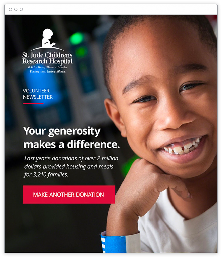
This email from St. Jude Children’s Research hospital is refreshingly simple and effective. It does a lot with one photo and fewer than 25 words. And it does something powerful and compelling. It tells a story.
First, this email is designed for past donors. So it begins by reminding the recipient that they’ve previously shown generosity and commitment to the cause of finding cures for childhood cancer.
Second, the second line in the email emphasizes results. It shows the reader that “last year’s donations” were meaningful, showing real numbers and highlighting the tangible support provided to more than 3,210 families. (I love the use of the exact number!)
Third, the whole message is designed on top of a smiling photo of a young boy. He’s looking directly at the reader. The wristband at the bottom of the photo a subtle indication that this boy is a patient, the kind of kid who might be part of one of those 3,210 families helped by past donations.
Note that the kid doesn’t look sad or in pain. Unlike some nonprofits that use sobering or shocking photos to guilt readers into giving, this photo is aspirational. It suggests that your past donation may be one reason the boy is smiling. That, in itself, is a miniature narrative: You gave. We helped families in need. And you’ve helped bring a smile to this young child’s face.
And finally, the email is anchored by a big, red, cant-miss-it button that asks the reader to “MAKE ANOTHER DONATION.”
This email is brilliant in its execution. It is short, compelling, and direct. Someone could read it in less than five seconds. This email does more with one photo and 23 words than most nonprofit emails do with hundreds of words and many more pictures. It’s a great reminder that quite often when it comes to email marketing, less is more.
Charity: Water
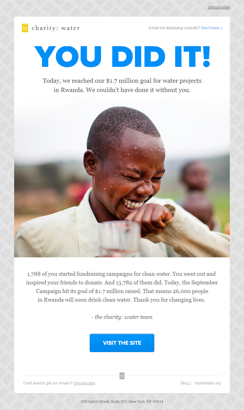
I’ve written and spoken about Charity: Water at length before — they have a strong handle on their design and messaging. And their emails may be their biggest strength.
The headline booms “YOU DID IT” above the photo of the child showing a genuine sense of joy (and with a visible glass of clean water in his hand). It shares concrete numbers to explain what was raised and how many donors joined the effort, then shows specifically how many people have been helped.
Finally, it explicitly thanks the donor — “Thank you for changing lives” — not for the money, but for the meaning of what they gave. The emphasis is on results, not revenue. They keep the focus on where the donation goes and whom it helps.
I love this example because it’s not about asking for anything, it’s about thanking supporters and giving them a sense of reward and accomplishment.
Charity: Water is playing the long-game here. They know they’ll come back again in the near future and ask for donations, but this email focuses on results and gives the donor a big positive reward.
Patagonia Action Works
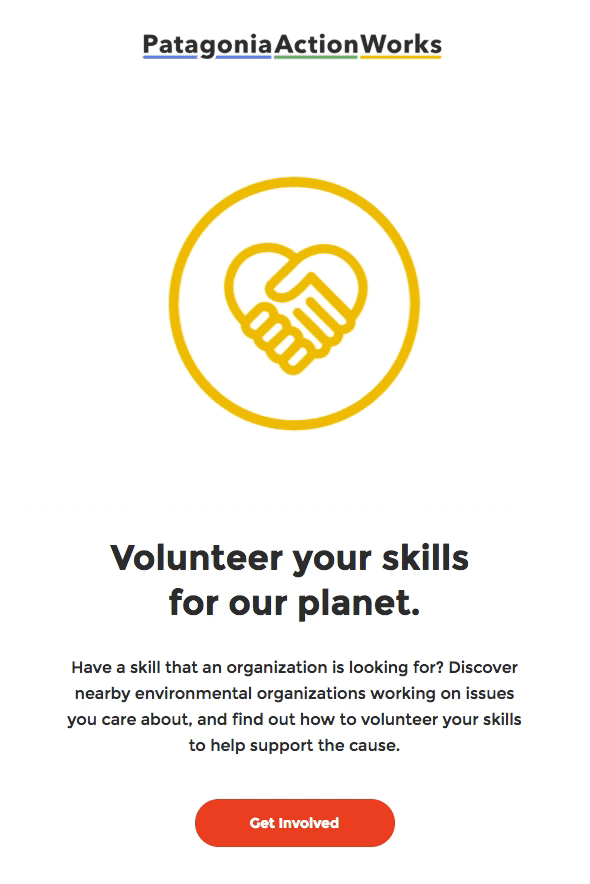
Clothing retailer Patagonia has a special program, Patagonia Action Works, that connects its customers with local environmental groups. This email encourages would-be volunteers to lend their unique talents to one of the many organizations it supports.
There’s a lot to like about this email. This previews only the top part of it (see the full email here), but it highlights a lot of what they do well:
First, it makes good use of animated images. Almost every email application and service now supports animated gifs (the most glaring exception would be Outlook 2007-2013). The animation asks simple questions about skills, then closes with the appeal for readers “volunteer with organizations that need your skills.” Litmus found that emails with animations tend to perform better than those without animations. The bold gold background and the smooth animation grabs the reader’s attention. The animated introduction here uses just enough text to keep readers engaged without overwhelming them, and it closes on a clear call to action.
Second, the headline uses clear, direct language. “Volunteer your skills for our planet.” They then describe what they’re asking for in two short sentences, followed by a bold red “Get Involved” button. If a reader never makes it past this initial call to action, it’s clear what this email is about and what is asking from supporters. They don’t overwhelm the reader with text. The email is clear, spare, and designed with ample amounts of white space that provides focus.
Finally, it speaks well for the Patagonia brand in general. An email like this shows that the clothing company doesn’t just sell outdoorsy stuff, it believes in the preservation of the environment and natural ecosystems. It shows a commitment to public parks and natural spaces. Whether or not someone commits to getting involved, it reinforces their brand and mission and gives them credibility as the place to go for outdoor clothing and gear. It sets them apart from Walmart or Target or Amazon. So it’s a win-win: they may help connect hundreds or thousands of supporters to local environmental groups, or if nothing else, they boost loyalty and enthusiasm for Patagonia in general.
American Red Cross
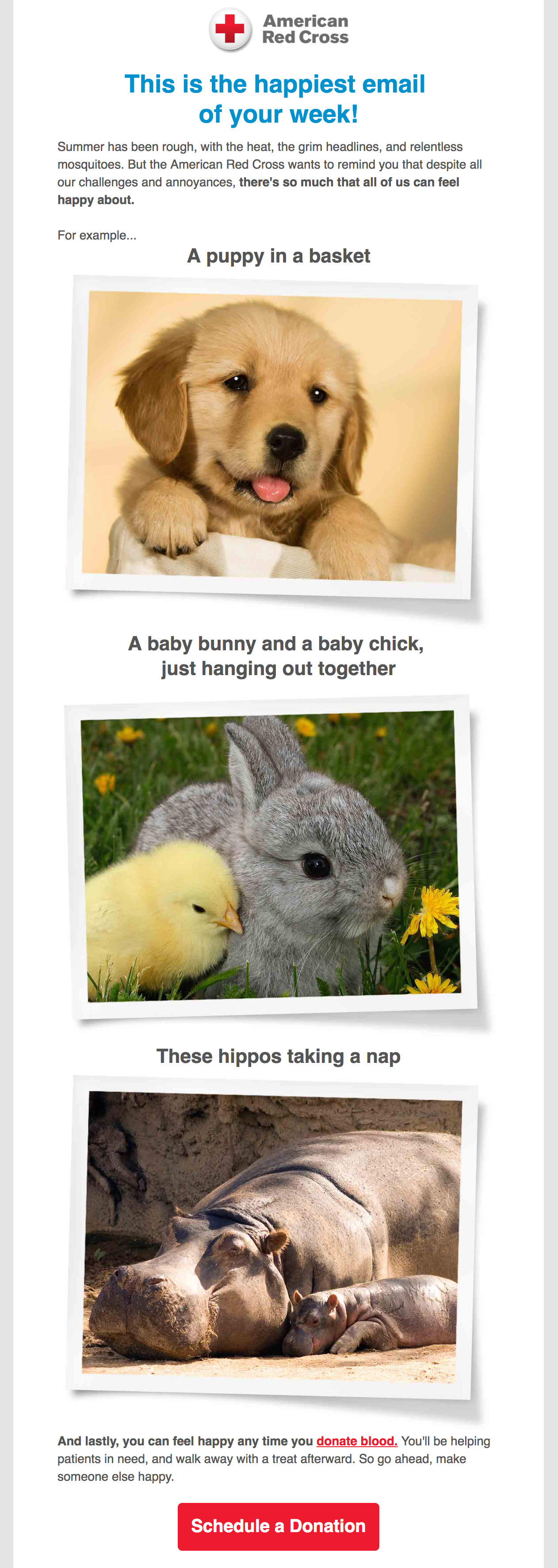
Fair disclosure: I created this one for the Red Cross in 2016 while I was their lead copywriter for emails going out to millions of blood donors. So yes, I’m showcasing my own work, but I think it’s worth sharing as a good example of breaking with expectations and conventions to get strong results.
Here’s the story: in the eight weeks prior to this one going out, donors were being sent serious emails warning of emergency blood shortages and critical needs of patients across America. And it was all true. Things were dire. But it seemed that week after week of grim, heavy, sobering emails about an urgent blood crisis had led to a point of diminishing returns. The rate of digital blood donation appointments was slowly dropping.
So that’s where this email came in. It was written and designed to be lighthearted, goofy, and a deliberate change of tone from the long series of dead serious emails that preceded it. My goal was to shake up the donors and surprise them. We wanted to jolt them out of their inactivity.
And it worked. This email went out on a Monday and was one of the highest performing emails of the year, both in open rate and engagements. The sudden shift in tone, style, and message helped spark a boost in blood donation appointments.
Lessons learned:
— Sometimes you need to shake things up to reach your audience.
— Don’t be afraid to take creative chances to wake up supporters.
— Mixing occasional lightness and humor into nonprofit messaging can bring great results
How to tell your nonprofit’s story in fewer than 20 words 6 Sep 2018 10:27 AM (7 years ago)

How to tell your nonprofit’s story in fewer than 20 words
One of the most common challenges I see with nonprofits is an inability to clearly and concisely explain who they are and what they do. Often, when I ask people I meet who work at nonprofits what their organization does, the answer can take minutes.
Why does this matter?
First, people often tune out a long, rambling explanation of what an organization does. If people stop paying attention to you, the odds of them becoming supporters or donors plummets.
Second, everyone in your organization, from the President to an administrative staff member to an intern should all be able to tell your organization’s story within a few seconds. This ensures that there is a consistent, clear message from everyone about what you are and what you’re doing. This helps spread the word and reputation of your organization across countless networks. If you can’t explain your nonprofit to others in one or two sentences, how will other people spread the word?
And lastly, from my experience working for and with nonprofits over the last two decades, if your organization can’t explain itself in one or two sentences, it usually suggests a deeper problem. Your organization’s vision and mission may be too fuzzy and undefined. There may be a problem connecting the work your organization does with the big picture goals you have. Or it might mean that there are competing visions within your organization about its mission. All of those are red flags to potential supporters. More than that, it means you may have some work to do make your organization more effective.
So if you can’t yet tell your organization’s story in a few words, it’s worth taking a little time to figure it out. Even if what your organization does is complex or complicated, it should still be possible to provide a clear story about your organization in a sentence or two.
Here are six examples of nonprofits that do this well:
Charity: Water
Charity: Water is a non-profit organization bringing clean and safe drinking water to people in developing countries
(17 words)
St. Baldricks
Give kids with cancer more options by funding the most promising research
(12 words)
Adopt a Love Story
Helping families overcome financial obstacles to adoption
(7 words)
Table
Providing healthy food to hungry Chapel Hill and Carrboro children every week
(12 words)
Eyes Ears Nose & Paws
Partnering people with dogs to improve lives
(7 words)
St. Jude
St. Jude is leading the way the world understands, treats and defeats childhood cancer and other life-threatening diseases.
(18 words)
or their even shorter version:
Finding cures. Saving children.
(4 words)
Those six nonprofits all do a great job telling their story in fewer than 20 words.
And in all six of those examples, the organizations tell short, compelling story.
Children face the threat of cancer and life-threatening diseases, so St. Jude is working to treat and defeat those conditions. Adoptions are expensive, which might mean kids might never find a new home, so Adopt a Love Story helps parents overcome financial obstacles. Many children in Chapel Hill and Carrboro, North Carolina don’t have enough to eat, so Table works to help provide them with food. Millions of people worldwide lack safe, clean drinking water so Charity: Water helps change that. Cancer research could help save millions of children, so St. Baldricks raises money to help find cures. Many people with disabilities need assistance to get through their daily lives, so Eyes Ears Nose & Paws trains and provides service dogs.
I was able to paraphrase their stories because their elevator pitches gave me enough information that I could reword what they do, just like I would if I were telling someone at lunch about any of these nonprofits.
Let’s break these down a bit and see what they have in common.
1. What and for whom
In traditional reporting, we often think of the five W’s and one H (who, what, where, when, why, and how). But nonprofits need to be able to strip that down to the most important two: what they do and whom they serve.
The why, when, where, and how are all important, but they can wait. You can explain the rest in speeches or on your website. But the short, essential elevator pitch needs to focus on what you do and for whom. If you can squeeze in some of the rest, great.
2. No wasted words
Go back and look at those examples. You’ll be hard-pressed to find a word in any of them that isn’t essential to the sentence: no fuzzy adjectives, flabby adverbs, or empty buzzwords. Nearly every word in these examples adds meaning.
Several of them have an implied “we” or “we are” and omit the name of their organization. They have confidence that we’ll remember who they are and keep the focus on what they do and whom they help.
3. Use enough words
The counterpoint to #2 is that you need enough words to explain the core idea of your nonprofit. Being too spare or too minimalist can be a problem as well. One nonprofit I came across has the tagline “Children first” on the top of its website. It doesn’t follow that with a clearer subtitle or explanation until you scroll down halfway down the homepage, and even then, the short explanation of what they do is on a “slider” that changes every few seconds, so it can be easy to miss the message about what they actually do. You see photos of kids in classrooms and young adults working with them — but what are they about? Health? Nutrition? Education? Something else? It takes some work to get that answer. Most visitors won’t make that effort to find out.
I’m not knocking this organization. I love what they do and their mission to help children. I might give them money someday. But their most prominent homepage message is too short to be meaningful for casual visitors. If they added a clarifying few words to it, they might be more effective in engaging potential supporters and donors.
4. Clear, everyday language
All of these avoid jargon, marketing-speak, buzzwords, acronyms, or any other murky language. They use clear, everyday, understandable words. This might seem obvious, but many nonprofits lead with aspirational marketing language that is unclear or doesn’t answer the basic question of what the nonprofit does.
5. They pass the “grandmother” test
Here’s the grandmother test: imagine that someone’s grandmother is sitting across from you in a living room and she asks, “what does that place you work for do?”
To pass the test, a) your answer must sound natural being said out loud, and b) it should be clear enough that this 80-something woman would be able to nod and understand.
If your answer would sound like a bunch of marketing gobbledygook, or you think the answer would baffle the grandmother, you’ve failed.
So if you’re a nonprofit, take a hard look at your website — would a first-time visitor understand what you do within a few seconds? If not, think about taking time to change that this week. Most likely, you’ve got a good story to tell, so make the effort to share it clearly with the world.
Just keep it short.
Client service lessons I learned from a terrible accountant 28 Jun 2018 12:55 PM (7 years ago)
Client service lessons I learned from a terrible accountant
Years ago, when I went from freelancing on the side to working with clients full-time, I needed an accountant — someone with expertise in taxes and finance who could help incorporate my business and sort out my accounting.
Another freelancer recommended a local accountant, who at first seemed nice and knowledgeable. We met and I hired her.
It didn’t go well.
After years of working with my own clients, I was suddenly on the other side. I learned first-hand how it feels to work with someone who didn’t treat me well. And so, within a few months, I moved on for another accountant.
But the upside from this unpleasant experience was that it taught me some valuable lessons about how I should work with my own clients in the future.
Here are four lessons my bad accountant taught me:
1. Explain how things will work
After my accountant and I started working together, I started getting calls from her assistant — someone I’d never met — who made random requests for financial documents. I didn’t know what they were for or why my accountant needed them. They never bothered to explain.
What I realized then was that after our initial meeting, I never got a clear picture of what working together would be like. How often would we talk? What would they need from me every month? Who would I be working with most of the time? What was I expected to do to keep this professional relationship working smoothly?
I was in the dark, expected to understand how business accounting worked. My accountant never made an effort to walk me through what to expect and how we’d work together. I never felt a sense of confidence or comfort about how it was working.
And, I realized, I hoped I never left my clients feeling this way.
Lesson learned: Always take a few minutes to help explain your process to a client — walk them through how everything will work: expectations for both sides, timelines for getting things done, and how often to expect regular check-ins. It never hurts to over-communicate with clients and keep them up-to-date on what’s going on and what’s coming up.
2. No surprises
One of the big decisions my accountant walked me through in our first meeting was whether to keep my business as a sole proprietorship or create an S-Corporation. She recommended the latter, but neglected to warn me about some of the trade-offs for changing to an S-Corp in the middle of the year.
The following year, this decision came back to haunt me when we were looking to buy a house — the mid-year shift to an S-Corp created some major tax complications that jeopardized our ability to get a mortgage and almost lost us the chance to get a house we really wanted for our family. It worked out in the end, but only after a lot of stress. Had my accountant given me a complete picture of the pros and cons of the decision, I might have reconsidered.
Lesson learned: Your job is to help solve clients’ problems, not create new ones. Don’t let them discover, like I did, that there are significant potential downsides to one of your recommendations. Clients count on you for your experience and expertise, but always take time to explain to them the costs and benefits of different options. Don’t let them be surprised down the road when your recommendations lead to problems that might have been foreseeable.
3. Be responsive and available
Sometimes I’d email my accountant with questions and not hear back for days. More than once I emailed her twice before I got a response. I wasn’t sure if she’d received the emails or just hadn’t bothered to respond. Even if she couldn’t answer my question right away, I’d have felt better knowing she got my message and would be back in touch soon.
Lesson learned: Being responsive to clients is as basic as it gets when it comes to customer service. Always get back to clients within a day. Even if you can’t completely respond to their question or request, let them know you got their message and give them a clear idea about how soon you’ll be able to help.
4. Don’t make your client feel dumb
When my accountant was about to prepare my corporate tax return, she needed to use my Quickbooks account. She asked me how soon my books would be reconciled so she could get started.
I honestly had no idea what that meant. I had to Google “reconcile books” to try and understand what she needed me to do. And still had no clue.
Even when I explained to her that I wasn’t sure how to do reconciliation, she pointed me to a how-to page on the Quickbooks website. I was still lost and wasted hours trying to do it myself.
Her sense, it seemed, was that this process was so simple and obvious that she didn’t really need to go into it. In her mind, this was obviously something I was supposed to handle myself and she would take care of the rest. But I wound up feeling like an idiot who needed a second accountant to help me work with the first accountant. This was probably the last straw. I stopped working with her the next month.
Lesson learned: What’s easy or obvious for you may be hard or unintuitive for your client. Don’t treat them like a fool for not knowing what you know. We all have different skills. Be clear about what work you’re responsible for and what you’re not — but offer to help them with some of those other things, even if you have to charge them more.
My experience with my old accountant taught me, above all else, to have empathy for my clients. Keep in mind the stresses, worries, and pressures they’re facing, and treat them the way you’d want to be treated.
In the end, that’s just as important as anything else you’re doing for them. Maybe more.
Six things you should never do in your email marketing 18 Apr 2018 12:48 PM (7 years ago)
Six things you should never do in your email marketing
While I worked for the American Red Cross, I wrote and designed hundreds of emails. Most of were sent to millions of supporters every week. I learned a lot of valuable lessons from the experience. Here are six top takeaways about what NOT to do with email marketing.
1. Expect people to read it all
I’ve written some emails with finely crafted narratives that moved some people to tears. And I wrote some emails packed with compelling statistics and facts designed to motivate supporters to action. What do they have in common? Most people never read them.
Think about how many emails you deleted from your inbox in the last 24 hours without ever opening them. When you send an email to your list, you’re lucky if a fraction of those people open it. And that’s not the worst part — most people who open your email will skim it for less than 12 seconds before moving on.
Some emails that contained my best, most compelling narrative writing got the fewest number of clicks. And many emails that were short, direct, and to the point often did the best. I learned that when you write for email marketing, you have to check your ego a bit and focus on effectiveness over craft.
If you’re counting on subscribers to luxuriate in your carefully crafted paragraphs, you’re going to be disappointed.
You get a few seconds to grab them. So don’t blow it. You don’t have time to “clear your throat” with a long paragraph setting up your real message. Don’t write long, complicated paragraphs. Use simple, short, clear sentences. Get to the point. Make it easy for people to skim the email and understand that you want.
Which gets me my second thing never to do…
2. Have no clear call to action… or too many calls to action
With only 12 seconds or less to grab most readers, make sure that within half that time, they can skim your email and know what you want them to do. Give your email a clear, focused call-to-action.
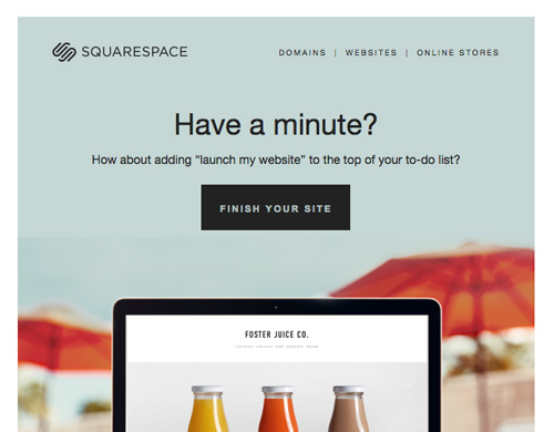
Look at this smart email from Squarespace, prodding a user to come back and complete a website project that has gone unfinished.
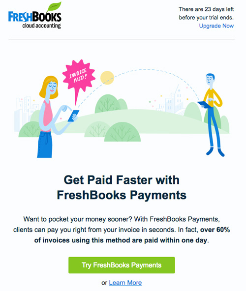
Here’s another good example from Freshbooks, which gets right to the point and tries to sell a potential customer on another one of their services. I get three sentences that explain the offer and a bright green button that asks me to try a service that suggests it will help me “get paid faster”:
Whether you’re asking people to donate money, subscribe to a service, or sign up for an event, make it obvious.
Give your email the “squint test” — if you sit back and squint at your email on the screen, can you still see where your attention is supposed to be focused? If it’s done well, you should have a clear, bold button or a big link that clearly indicates what you want from them.
Some emails suffer from the related problem of having too many calls to action — multiple buttons and links, all going to different places. The worst thing you can do is confuse your reader. It’s OK to have more than one link, but it should be clear which one is the obvious best choice. The example from Freshbooks actually has two links there, but it’s clear which one they most want me to click.
3. Put important information inside images
Here’s a fun fact: today, about a third of all email readers block images by default. Outlook still blocks images by default for most users, even in 2018. There are plenty of guides to overcoming this challenge, but ignore this issue at your peril. They might see something like this:
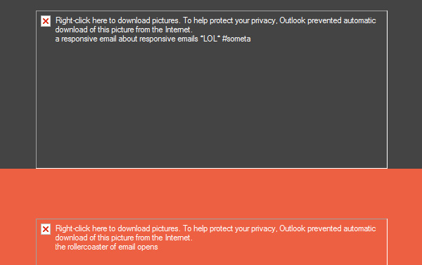 (image from Litmus)
If you have something really important to say in an email, don’t put it in an image. A big chunk of your readers just won’t see it. You’re better off using images to support your message with visuals, not as a place to convey your actual message.
4. Design only for big screens
In early 2017, data showed that 51% of all email is opened on mobile devices. And that trend has been rising for years. If anything, we should all be designing and testing emails for small screens first, and big desktop screens second. And yet, many communications and marketing teams rarely do anything but preview and test emails on laptops and widescreen monitors on their desks.
5. Send too many emails
This one is easy: don’t make people regret signing up for your emails. When someone subscribes to your email list, there’s an implicit assumption you won’t abuse that trust and flood them with emails.
Pick your spots to engage with your audience, and make those opportunities count.
If you blast them with 3-4 emails a week, two things can happen with many of them, and neither are good: 1) they’ll unsubscribe, or 2) they’ll just ignore you and tune our all future emails. Either way, you’ve lost the ability to connect with

Personally, I’ve unsubscribed from emails from causes and organizations I strongly support — or who I’d given money to in the past — because I just couldn’t take the constant email noise.
Bottom line: don’t give flood your supporters inboxes or they’ll tune you out.
6. Write like a robot, a greeting card, or a Dentist’s office
The key to effective email marketing is authenticity — you want your audience to feel like the message is coming from a real person or team. It should seem human and conversational.
Too many marketing emails miss this, and their language is often riddled with clichés, stiff marketing speak, or transactional messages that seem generated by a computer algorithm (maybe some of those are).
Write the email as if it were going from you to ONE supporter. Think of it as a really short conversation with you asking a favor at the end. Use natural language — contractions, short sentences, and simple, direct language. Read it out loud to yourself to hear if it sounds like a human being.
Let go of the impulse to be fancy, clever, or sophisticated, and you might be surprised at how good your results will be.
Five lessons every nonprofit can learn from Charity: Water 1 Mar 2018 3:30 AM (7 years ago)
Five lessons every nonprofit can learn from Charity: Water
1. Provide a short, clear explanation of who you are and what you do
Many nonprofits struggle to express who they are and what they do in a short, simple sentence. Charity: Water doesn’t. Here’s their mission statement:
Charity: Water is a non-profit organization bringing clean and safe drinking water to people in developing nations.
That statement is 18 words long, and every word matters. There’s no jargon, no marketing language, and no boastful adjectives. Through clear, natural language, we learn what Charity: Water is, what they do, and whom they help. You’d be hard-pressed to find a better, more succinct “elevator pitch.” And when you consider the complexity of what they do – international projects that involve complicated logistics, labor, and technology – their elevator pitch is even more impressive.
2. Give visitors a clear action to take
Every effective website has a job to do. Maybe you’re trying to build a subscriber list for your new podcast. Or bring in donations for a nonprofit that helps provide food to families in need. Or sell your hand-crafted sky-blue North Carolina Tar Heel socks. Websites can offer many different things, but they should all provide a clear focus on the most important action visitors should take before they leave.
Charity: Water’s primary call-to-action is to ask visitors to support their work through donations. It’s nearly impossible to miss.
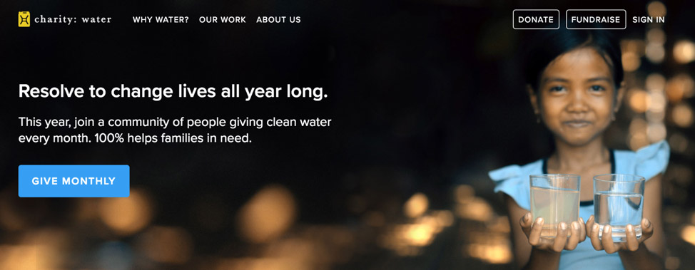
That big, bold, blue button jumps off the page, next to the photo of the beautiful young girl. Paired with the headline, “Resolve to change lives all year long,” it asks visitors to “Give Monthly.” The button doesn’t have to compete with a lot of visual clutter or rambling text. It stands out after only 24 words of explanation.
You can also make a one-time donation (the button for that us up in the top-right corner), but Charity: Water clearly values recurring donations to support their work, so they’ve made “monthly” option is the easiest, most obvious way to get involved and support them.
Naturally, the site has plenty of interior pages where visitors can learn more about the organization, its mission, their funding, and the results of its work, but they don’t try to pack all that in on the home page. They keep it blissfully clean and focused.
3. Create and use great photos
Charity: Water wisely understood from the start that it wouldn’t be enough to tell people about the problem of water in developing countries or to boast about how it had done great things to improve the water supply in villages and towns on the other side of the world. They needed to show it.
And it wasn’t enough just to find photos of pumps and machinery – they needed people. Ultimately their work is about people; it’s about helping improve the lives of countless mothers, fathers, and children in the communities where they do their work.
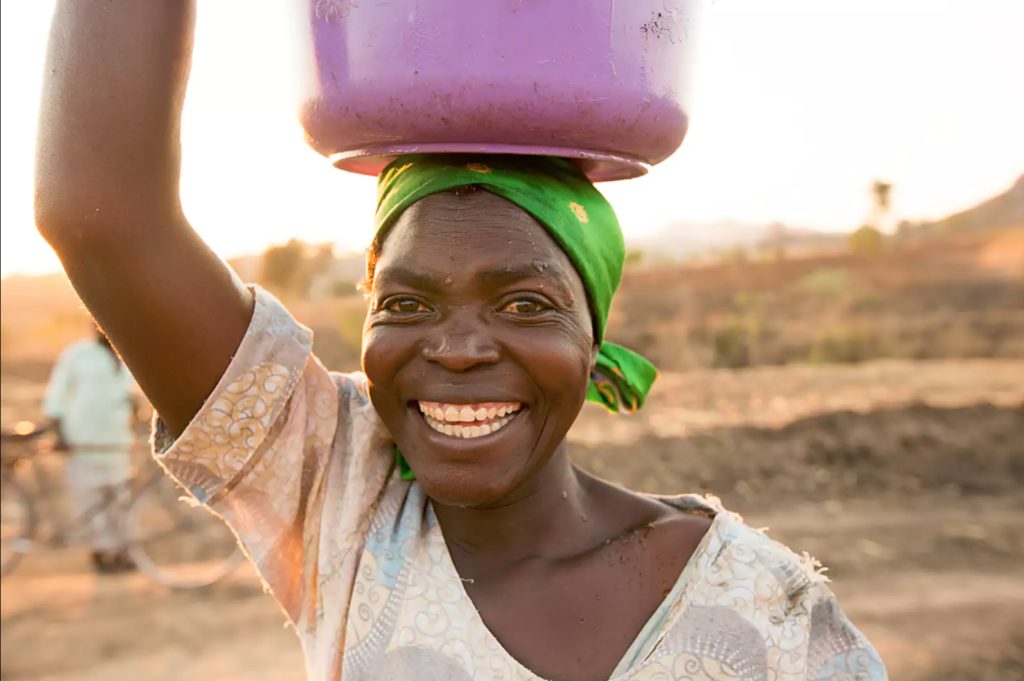

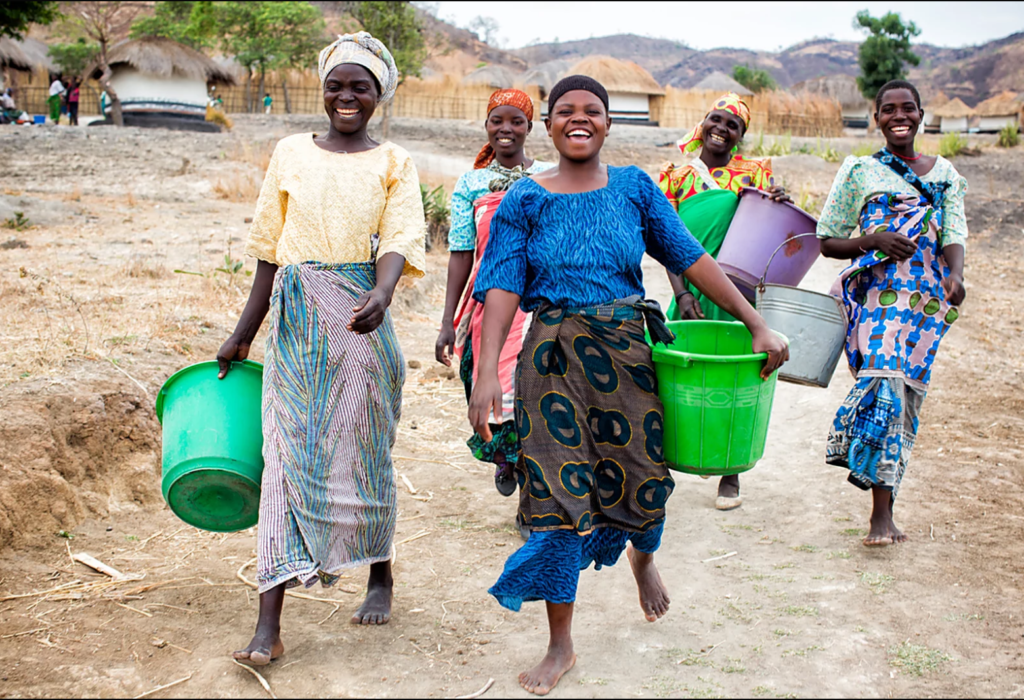
If you browse Charity: Water, you don’t see photos of sick, dying people, suffering from the impact of infected, unsafe drinking water (although that’s happening every day in areas they focus on). Instead, most often, you see the “after” photos – pictures of people whose lives have been transformed by the help Charity: Water provided. Their photos aren’t meant to guilt visitors into giving; they provide inspiration and a vision of possible successes to inspire donations.
Almost every organization I’ve worked with admires good photography, but very few have good photos that reflect the work they do or the impact of their work or their product. Often, organizations fall back on uninspired photos captured on iPhone cameras or stock art that vaguely matches what they care about. Good, professional photography isn’t cheap. But the cost of relying on bad, uninspired photos can be hard to calculate. If you can’t afford the help of professionals, consider these tips on getting better nonprofit photos yourself:
- Visual Storytelling: Photography Tips for Nonprofits (by Naomi Figueroa)
- 6 Tips for Better Photographs (Jeff Jones)
- How To Take Better Photographs (KnowhowNonprofit)
4. Stories, not “web content”
Charity: Water tells stories proving that donations lead to tangible, lasting, and meaningful results. As founder Scott Harrison explained in an interview, their message is about “opportunity, not guilt.” They use storytelling that shows a problem, how Charity: Water helped solve it, and why your support can create another story of success.
Charity: Water takes time to create rich narratives about both recipients and donors. It’s a lot more than self-promotional video or “web copy” designed to trigger SEO buzzwords. Here’s a great example of their storytelling:
But it’s not just about video. Their written storytelling is engaging and compelling as well. Consider the start of this story about how clean water changed one woman’s life:
Every day Helen Apio used to say to herself, “How should I use this water today? Should I water my garden so we can grow food? Should I wash my children’s uniforms? Should I use it to cook? Drink?” With two children, one husband and only ten gallons of water, Helen always put herself last.
But not anymore.
Through Apio’s personal story, they illustrate how clean water can improve not only health, but also self-esteem, confidence, and optimism for the future.
Consider how Tyler Riewer, brand content lead for Charity: Water, explains their approach with storytelling and their emphasis on “hope, not guilt”:
Storytelling allows supporters to understand Charity: Water’s work on a more personal, human level. What might be a technical, boring explanation of their work to provide clean water supplies is instead a moving, compelling argument to support their work.
5. Give supporters reasons to trust you
A common problem for many nonprofits is that would-be donors worry that their money may be wasted or misused. Charity: Water counters this by communicating key ideas to boost credibility and trust in their work.
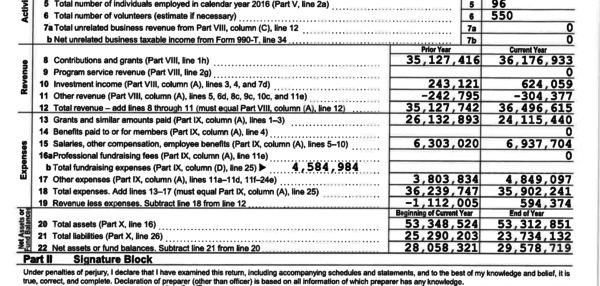
First, they dedicate an extensive part of their website dedicated to their completed projects. You can browse a map that shows all the places where they’ve done work, and drill down to learn details about exactly where each project was and how many people it helped. Second, they make their financials public. Interested supporters can look at their books and see where all the money goes.
Charity: Water overcomes skepticism with proof of tangible results and open books. Not every organization can do it as well as they do, but it’s a good model to strive for – transparency and accountability that lead to trust. And trust, in turn, is one of the keys to gaining supporters and subscribers.
Ultimately, Charity: Water does a great job communicating what they’re about, what they’ve accomplished, and why supporters should trust them. Any nonprofit that can do the same will be on the right track.
What does your website “shout across the street”? 20 Dec 2015 8:51 AM (9 years ago)

What does your website “shout across the street”?
One of the biggest influences and inspirations in my life was my high school journalism teacher, Alison Rittger, an overcaffienated editorial drill sergeant who was always armed with a red pen and a relentless prejudice against needless words. She taught me many lessons about writing, editing, and communication that I still use today.
One idea she taught was the “shout across the street” question. We used this concept when we had to come up with headlines for newspaper stories. The goal was to communicate the essence of the story in a single, clear sentence, while avoiding ambiguity and wordiness. The concept was to imagine a friend standing across a busy street from you, and you are trying to shout to them what the story was about. You can’t have a conversation, or even a long explanation. You need something, short and shoutable. Maybe 10 or 12 words at the most.
The history of journalism is rich with iconic headlines that meet this “shout across the street” test:
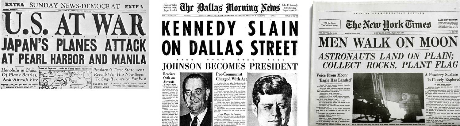
All of these headlines give readers the core idea of a story at a glance. You could shout any of these across the street and your friend would understand.
This lesson from Ms. Rittger sticks with me today when it comes to web and digital products. Too often, websites fail this test completely. You can stare at many sites for a minute and really not understand what it’s about, who it’s for, or what it’s trying to deliver. Often this is because of an organization or company’s mistaken belief that customers or visitors already “know” them, and so their site doesn’t need to explain. Sometimes site owners put too much faith in the patience and willingness of visitors to read long chunks of marketing text.
SO just as an effective headline should pass the “shout across the street” test, a good website should tell a visitor — within a few seconds — who you are and what you can do for them.
The good news is that this isn’t a difficult problem to fix.
Start by deciding what you want to shout across the street.
Spend time crafting a short sentence that explains your company or organization and what it’s trying to do. Like an elevator pitch, only shorter. You’ll have plenty of chances elsewhere on your website to explain in length about your brand, your mission, your products, or your people at great length. But what you need here is the simplest, most pithy summary of what you’re about. This task is never easy: no client of mine has ever been able to come up with this quickly or without lots of back and forth between writers, editors, and other stakeholders.
But before you throw up your hands and object that this is impossible, consider a few examples of sites that do this well:
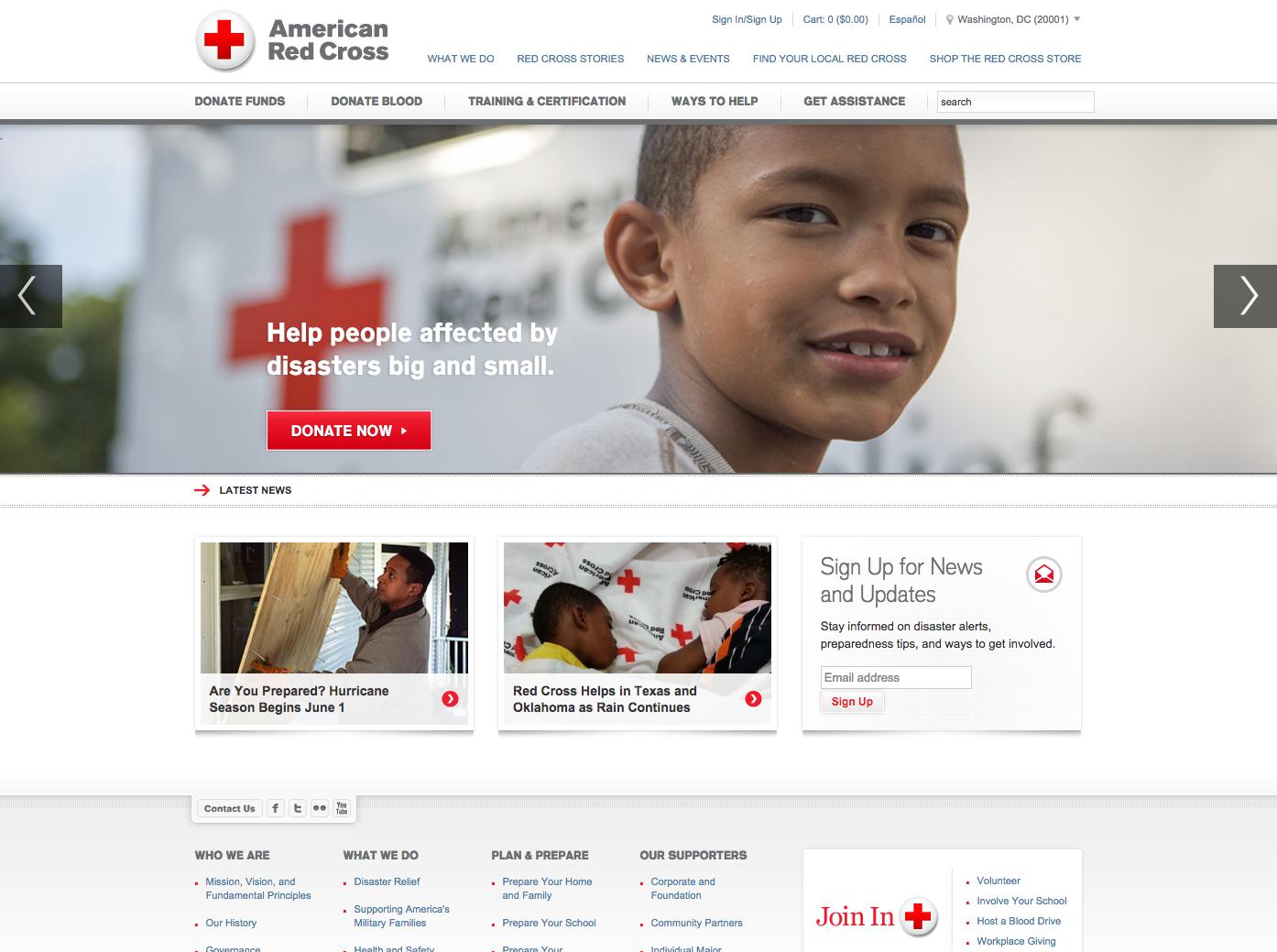
The American Red Cross passes the test. Our eye is drawn to the photo of the young boy, and next to it is a eight word summary of what they’re working to do — “Help people affected by disasters big and small” — followed by a bold, prominent donation button. This home page not only “shouts across the street,” but helps prompt users with what they want them to do first — contribute money to support their work.
Another strong example is Kiva, a nonprofit that provides micro-finance to individuals in developing countries:
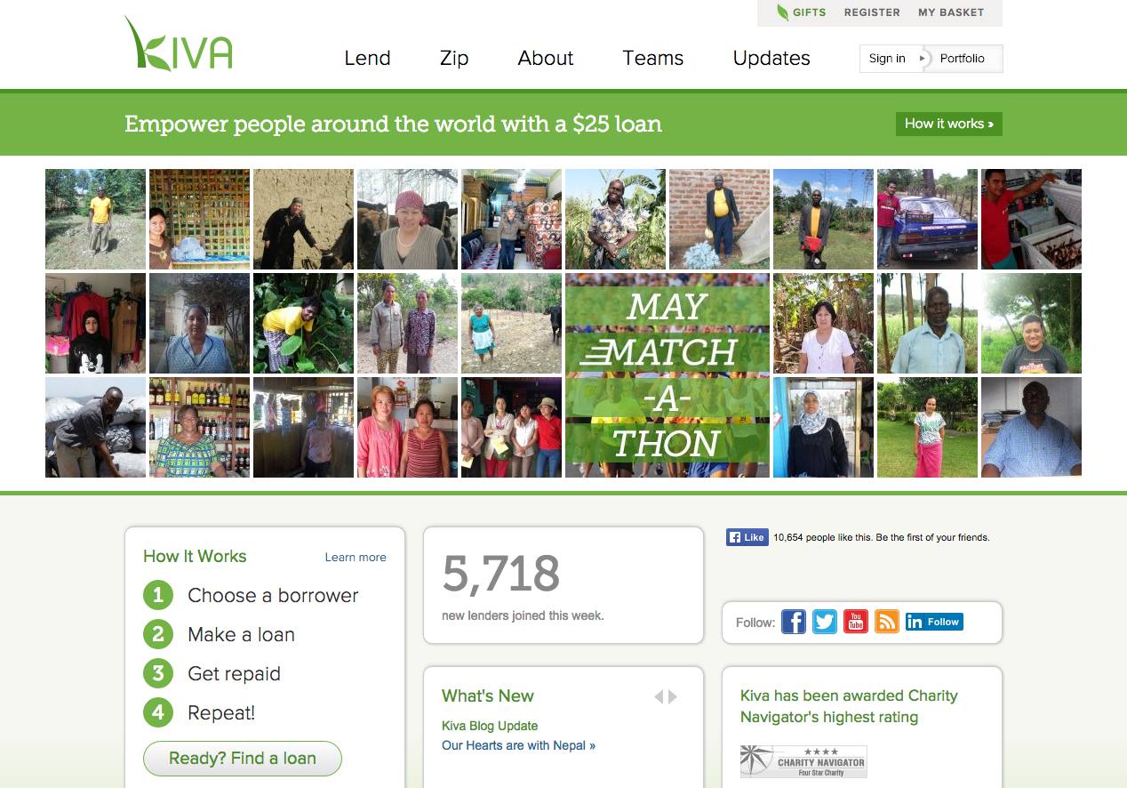
Their homepage delivers a clear, nearly-impossible-to-miss header that explains what they do — “empower people around the world with a $25 loan” — with eight-words I could shout across Pennsylvania Avenue.
How about the ACLU?
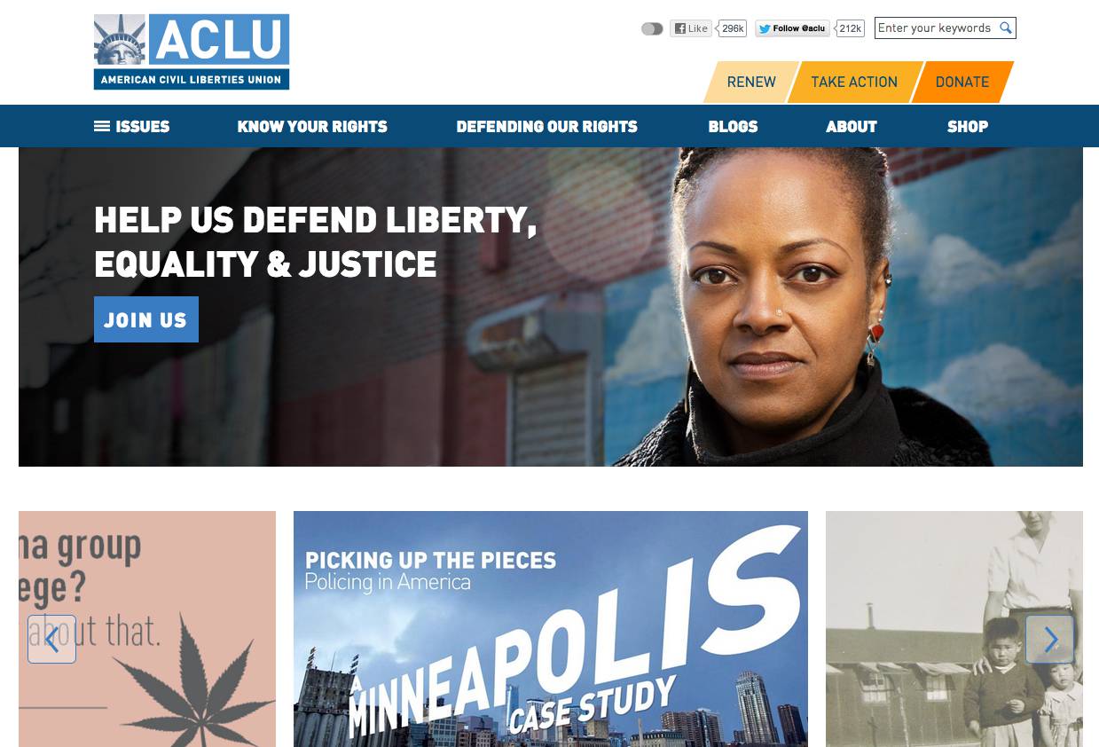
Just like Red Cross and Kiva, the ACLU uses prime visual space, strong contrast, striking photography, to explain who they are and what they do, and inviting visitors to join their fight: “Help us defend liberty, equality & justice.” Their website distills their mission down to seven words.
All three of these examples pass the “shout across the street test” — the vast majority of visitors will understand what each organization is trying to do at a glance, just a newspaper reader makes sense of a clear, well-written headline.
This approach can also work on interior website pages as well. Quite often, visitors find your content from a link to a story or blog post, and if possible, you still want to pass the “shout across the street” test there as well.
Look at how People for the Ethical Treatment of Animals (PETA) handles this problem:
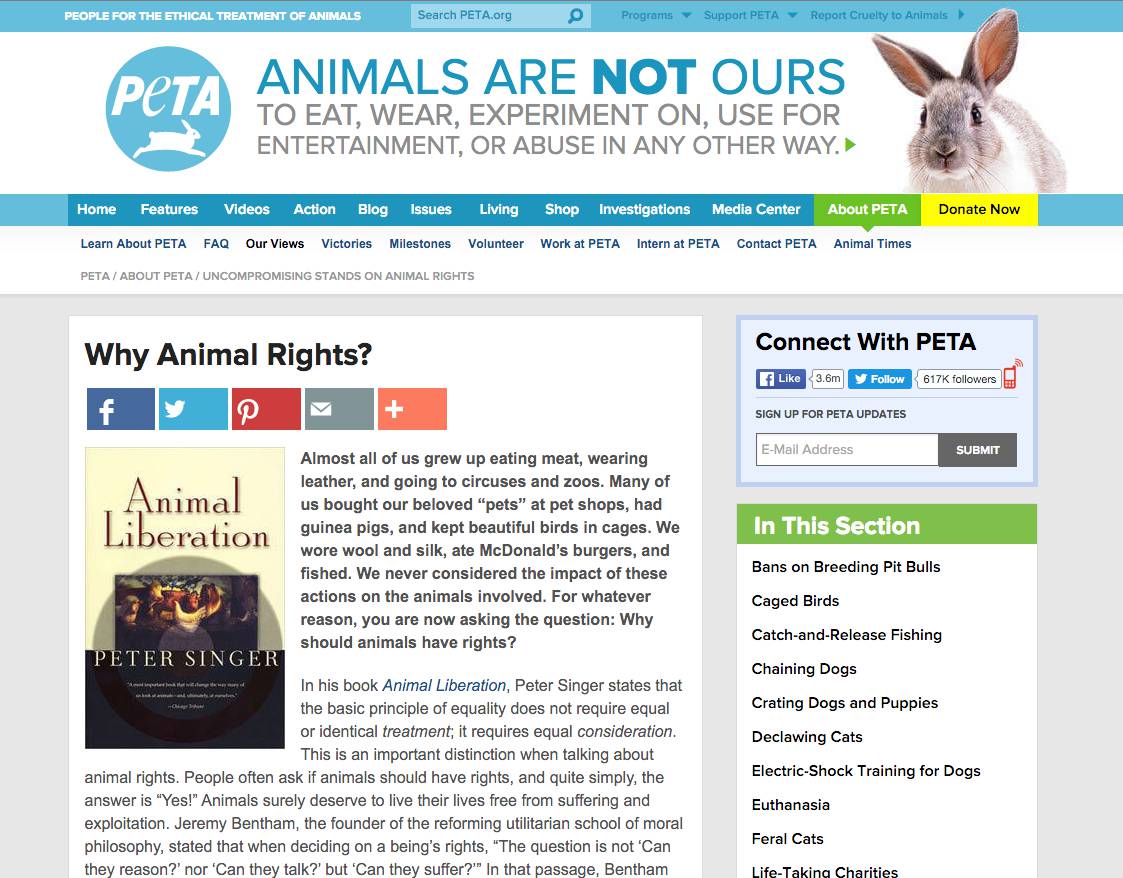
In the header on every page, next to the logo, they have a nineteen-word summary of what they stand for: “Animals are not ours to eat, wear, experiment on, use for entertainment, or abuse in any other way.” No matter how you get to a page on PETA’s site, you can quickly figure out what they’re about. And whether you agree with their take or not, you know who they are and can decide whether or not this is a site that speaks to you. If you share that sentiment, they make it easy on every page to donate money to support their efforts.
. . .
However you do it, try to get your website to pass the “shout across the street” test.
It’s not easy to come up with a pithy, concise sentence that can summarize your company or organization. But you should try. Otherwise, whatever you’re trying to say is going to get drowned out with the noise of the street.
Give your visitors one thing to do first 24 Nov 2015 8:39 AM (9 years ago)

Give your visitors one thing to do first
What is your website’s job?
Answering that simple question can be surprisingly hard for many people. Websites need a clear purpose if they’re going to be effective. Quite often, clients struggle to explain the main goal of their website or how they would determine its success. They value the web and the importance of a website, but they often lack a clear, focused sense of what their website needs to accomplish.
As one of my mentors once put it: “websites are not meant to be, they do.”
You can define that however you want: sell shirts, add subscribers, or persuade voters. But an effective website rarely works without a clearly defined sense of purpose.
To that end, I always advise clients to ask themselves: what is the one thing you want users to do FIRST when they come to your site? Your website might have a wealth of resources, articles, and services for customers or followers to explore, but you should know exactly what one thing you’d want them to do on your site, if they did nothing else.
Consider Dropbox’s website:
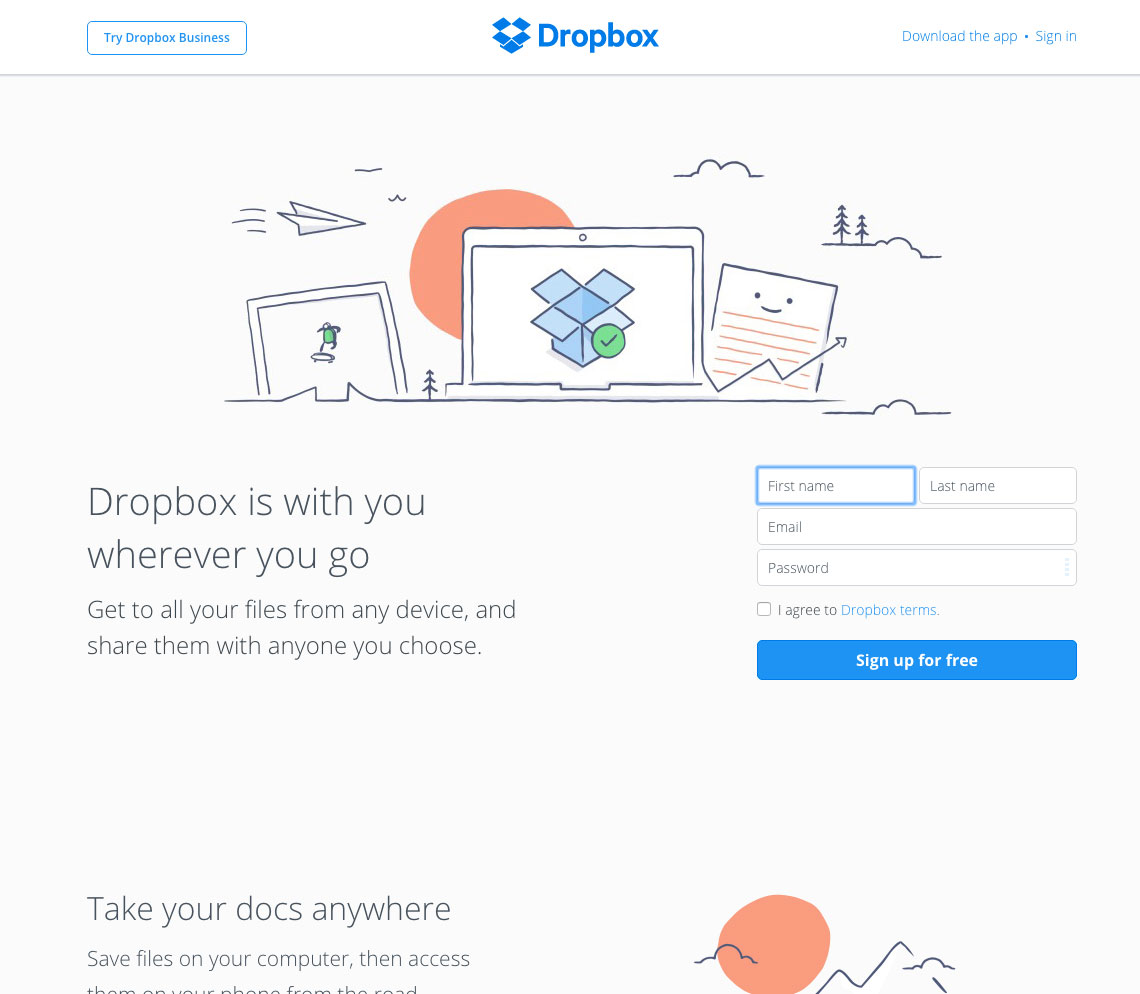
Dropbox has a wealth of content: how-to-articles, productivity tips, customer support tools, technical details about their services, and so on… but their home page is gloriously focused on one thing: getting you to sign up and try it out. They don’t bury would-be customers with information or marketing language — they focus prospects on providing their email and trying the service.
Likewise, take a look at MailChimp, which uses a similar approach.
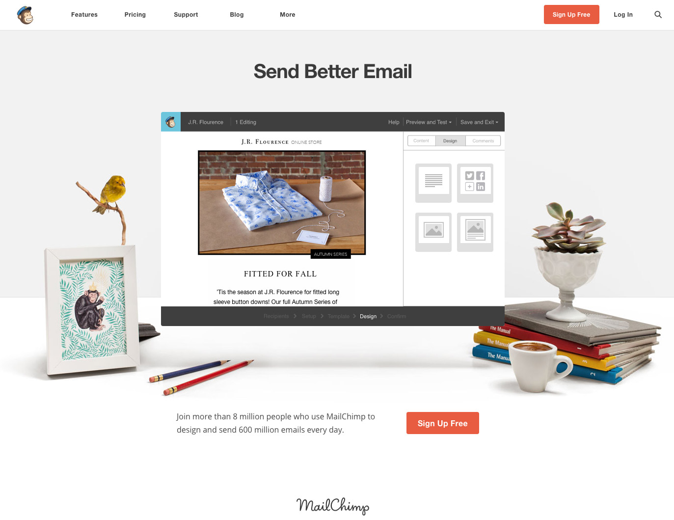
Mailchimp’s home page has big blocks of text, no heavy selling to persuade would-clients on the merits of their software. They steer users towards a huge red sign up button, wrapped up in a design element that showcases the software and a clean, seemingly peaceful work environment. You can click on “features” or “blog” to dig deeper into what they offer and how to best use their services, but the homepage has a focused design to do one thing: get people to sign up for a free trial.
Let’s look at a different type of website. Look at UNICEF, the United Nations Children’s Fund. Their mission is to save and protect “the world’s most vulnerable children, working to ensure child rights and providing health care, immunizations, nutrition, access to safe water and sanitation services, basic education, protection and emergency relief.” To do that, they rely almost entirely on the support of donors. So clearly, this is a focus of their website homepage:
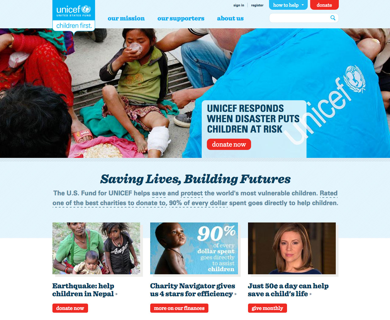
The homepage does a fine job, both visually, and with an economy of words, in explaining what UNICEF does and making a compelling case for why visitors should support it. At first glance, there’s a lot going on here, but clearly fundraising is key: there are five red buttons on the homepage, which visually jump off the page, and four of them lead users to a donation page.
Clearly, most than anything else, UNICEF is trying to nudge users to donate. Their website design seems built to make it almost impossible to miss a chance to support their work. Anything else on the site seems secondary. And that’s fine.
Websites are often big and complex and need to accomplish a lot of things. Most people want visitors to explore their site and return often. So obviously, sites need to be able to do lots of things.
But that doesn’t mean a site shouldn’t know what it wants its user to do first. Analytics show consistently that web traffic is fleeting and fickle: most users leave a website within the first minute. Try as we might, even the biggest sites can’t keep most visitors there for long.
So since you can’t hang on to visitors for long, why not make it easy for them to do the most important thing first?
16 questions to answer before starting a website redesign 5 Nov 2015 3:15 AM (9 years ago)

16 questions to answer before starting a website redesign
One common misconception I’ve often heard is that a website redesign is smaller project than creating a new website. People underestimate the challenges of reworking an existing site, and, as a result, wind up frustrated, disappointed, and unsatisfied with the result.
A new site can be anything: like a new house, it can be built from the ground entirely the way you’d like it. But a redesign poses different challenges: you’re dealing with something that already has a foundation, architecture, decorations, and things living inside it. You can change it, remodel it, but there are limitations and challenges. You rarely need just a fresh coat of paint: more often, you need to scrape off old ugly wallpaper, break down some walls, add rooms, replace plumbing. Sometimes you need to gut the whole place and rebuild almost everything.
A redesign is often a harrowing and challenging experience: all the more reason to make sure you’re doing it right… or if you really need to do it at all. So before you start, here are the essential questions to answer.
Big Picture Questions
1. Do you really need a redesign?
What’s wrong with your current site? What is broken? Are there significant, meaningful problems with the site that need to be addressed? If you can’t name those problems, you can probably stop here.
If you’re itching for a redesign just because your website feels “stale” or isn’t as flashy as some other site you visited, that’s probably not a good enough reason to start ripping pixels up. Improving the look and feel of a design is important — and can be a big part of a redesign — but shouldn’t be the only reason you’re re-doing your website.
A redesign should solve problems and help your company or organization do something better: increase sales, grow a readership, promote more sign ups. It shouldn’t just be to add the latest cool visual gimmick to your site.
2. What is the goal?
If you can identify meaningful problems with your current site, the next question to answer is what are the goals to address them? Be concrete and specific. Some examples:
- “Make it easier for visitors to subscribe to our newsletter and double our subscribers before the end of the year.”
- “Make our website more usable and readable on mobile devices.”
- “Promote our events better and boost our sign ups by at least 25%”
- “Encourage readers to share our stories on social media and increase our social network sharing by 50% by the end of the year.”
- “Sell more of our books directly from the website than we did last year.”
3. Who is this site for?
Who is currently visiting your website? (If you don’t have basic analytics in place yet, don’t start a redesign until you do.) What do you know about your visitors/users? If they aren’t your target audience, then who, ideally, would be? Who do you want to connect with your website? A helpful exercise here can be to define and describe the “persona” of a target user.
4. What do current site visitors/customers complain about? What are they asking for?
Many clients I work with already know the answer to this question. Typical complaints are things like:
- The website is unreadable on an Android device
- They try to sign up for a workshop, but the form doesn’t work
- The navigation is too confusing and they can’t find what they’re looking for
If you don’t know what users want or don’t like about the current site, ask them.
Ask them to answer a short survey. Ask for suggestions in a post. Ask followers in a tweet. If you have an email list, send a special message asking for feedback and suggestions. With tools like Survey Monkey, MailChimp, and Google Forms, there’s no excuse for ignorance about what your current visitors like and don’t like about your current site.
5. What do you want someone to know or understand about you within five seconds?
Research consistently show that most people typically leave a website between 5 and 15 seconds of first visiting it. This means you’ve got a very small window of time to hook someone before they click away to Facebook or Buzzfeed.
So let’s be pessimistic for a moment and assume that your user WILL leave after a few seconds. Given that, what is the one thing you want that person to know or understand about yourself, your organization, or your company during that fleeting moment? An effectve website can communicates some key information in that short opportunity. Some examples:
- We raise money for blood donations and emergency relief
- We are a nonprofit working to reduce child hunger
- We sell organic cupcakes
- We review mobile apps
6. When someone comes to your site, what one thing you want them to do first
You might have a website loaded with articles and tools and resources, but, If someone comes to your website — and doesn’t stay long — what would be the one thing you’d want to them to do? Do you want their email? Do you want them to sign up for a free trial? Do you want them to play your latest video? However you answer that question, your redesign needs to focus on that as a primary goal.
This isn’t to suggest that you don’t want to strive to encourage engaged users who explore your site thoroughly and return often — everyone does — but as a starting point, it’s important to focus on the most critical thing you want a visitor to do if they come to your site.
7. What tone do you want to convey?
An effective website conveys the persona of your organization or company; it sets the tone for how you should be perceived. A bank or insurance company may want to convey trustworthiness and security. A dating site may want to communicate fun and optimism. A nonprofit that rescues pets may want to convey warmth and hope. Before you can really make informed decisions about the visual design of a site — the colors, typography, and art — you need to know what you want those elements to communicate. I’ve seen clients take the reverse approach: they see a website they like, even if its for a very different type of product or service, and try to apply it to their site, even if it’s a clear mismatch in terms of the personality and tone.
If you’re about to embark on a redesign, start with some general concepts to build around when it comes to the tone and style of your site. Once those are established, making decisions about aesthetics and visuals becomes less subjective and more driven by the organization’s goals.
8. Is the site structure generally sound?
Going back to the house analogy, sometimes you look at a house with “good bones” — all the key structural elements are good, and the improvements are mostly secondary things: replacing carpets, repainting walls, and updating some appliances. A redesign of a site with “good bones” might focus primarily on tackling presentational elements: making the site look better on small screens and tablets, improving typography, cleaning up icons, etc.
But often, a redesign needs to first rebuild the underlying structure of a website: changing or adding types of content, rethinking the way content and stories are organized, coming up with a newer, more intuitive navigation system. If a redesign needs to handle this kind of change, it’s important to tackle the big issues before getting into the smaller stuff. You don’t pick out new paint colors before figuring out how many rooms you need to add to the building. Tackle the big stuff first.
9. Do you have a CMS? If so, is it the right one?
A surprising number of websites still operate without any kind of content management system (CMS), the digital equivalent of an old car held together with duct tape and twist ties. I also see many websites running on an outdated, custom-build CMS that they outgrew years ago. Other sites run on a modern CMS, but it isn’t working well for them. Or it’s too difficult or frustrating for their team.
When you’re about to launch a redesign, this is a big question to answer first. Switching to WordPress or Drupal may be a worthwhile move that will offer many benefits, but it may likely impact the cost and scope of the project. It also may require additional time to train staff and get them comfortable with a new CMS before the site relaunches. Planning for this at the outset will help keep your time and budget expectations realistic.
Visual & Design Questions
10. What are the visual and branding requirements (if any)?
A redesign is rarely a wide-open, anything-goes creative exercise. A company or organization often has existing branding elements that need to be incorporated in the design, such as a logo, a color palette, or company typefaces.
The problem is that sometimes, a redesign is well underway when the stakeholders responsible for these brand and style guidelines get involved in the project. The last thing you want to find out two weeks before launch is that the color or logos you have been working with can’t be used.
Before any redesign begins, it’s important to get these requirements on the table from the start. If you’re not sure, ask. Surprises are fun for birthday parties, not design projects.
11. What sites are visually inspirational?
I always ask clients to provide examples of websites they admire for one reason or another. More importantly, I ask them to explain why they like them. While you never want to copy someone else’s website design, it is very helpful know what websites (or elements of websites) are appealing.
I ask this not because we would ever clone someone else’s design, but to get a sense of what a client likes. It might be a whole site, or part of it (“I really like how this site navigation is big and floats a the top”). It can help guide discussions of what elements and approaches would work with the redesign, especially in the service of the big answers provided above.
For example, someone might like how The New Yorker features it’s top stories. This can lead into a conversation about what they like about it and how a similar approach might work — or might not — for their content.
A second reason this question helps is that it can allow you to clarify your terms early on. One thing I learned early in my design career is that words like “bold” or “modern” or “friendly” mean very different things to different people, especially people who aren’t designers. These words are dangerously subjective. A better approach is to see what a client perceives to be “bold,” “modern,” or “friendly” through their inspirations. And again, that information can help steer the visual design in the right direction.
12. How will this look on different size screens?
Ten years ago, when I designed mock ups of websites for clients, I’d show one size for the content: something that would fit on a “typical” computer monitor. Designing for the web was still a lot like designing for print: you had a canvas and created a design to fit it.
Today, the same website is expected to look good on a 27-inch iMac or the phone in your pocket. You can’t just leave that to a developer to “figure it out” — you need to think about how the site will be experienced at different sizes. With my clients, I tend to favor the shirt-size analogy: we can’t design for 50+ specific mobile devices, but we can decide how the site will adapt at a few basic sizes: small, medium, large, and extra-large. If you wait until late in the project to start thinking about these different ways of rendering the website, it becomes more challenging to build.
13. Will you be expanding this new design to other media & social media networks?
A web presence used to start and end with your website, but now, it often extends well beyond it: to Facebook, Twitter, YouTube, Instagram, and in email campaigns. A new look and feel for your site may demand changes to those as well. Don’t wait until you’re about to launch a site to think of all the other places your content lives in the digital universe: think ahead and plan for how to roll out updates to all those other media as well at the same time.
A little early planning, and it can be easy to generate new banners and icons to fit these other networks at the same time art is being finalized for the website. Too often, organizations forget about all these other places until right before (or after) a redesign goes live. And the result is a mad scramble to ask a designer to relocate the the source files and create all these additional files and images. Since you already know you’re likely to need all of these things: make it part of the redesign project.
Getting It Done Questions
14. Who has time to do the work?
Once you’ve answered all the above questions and have a clearer picture of what you’re looking to do with a site redesign, the biggest remaining question is to figure out who will do all this work? Do you have enough in-house experience or time to do it? If you have an in-house digital team, are they free to make this a primary focus for the next few weeks or months?
If the answer to either of those questions is “no,” you might need to consider getting outside help.
15. Where is the content going to come from? Who is going to create and edit it?
It’s cliché to say “content first,” but I’ve worked on more than my share of ambitious web projects for sites that had no practical content plan. Months of design, code, and review went into a big design project, and then after the site launched, there was no one in charge of making sure the site was kept fresh with new, compelling content.
Sites like these can become very expensive brochures on a digital coffee table. And before long, they become irrelevant.
Several projects I worked on planned to rely on “user-generated” content, and to this day, I’ve almost never seen that work.
The best sites I’ve worked on almost always were built with a clear vision for who would write and edit content for it well ahead of time. If anything, they already had a surplus of content, or a wealth of overlooked great content, and the redesign was vital to help better showcase the work.
If you can’t say how and where the ongoing content for your site is going to come from, you’re probably not ready to move forward with a website redesign.
16. After the redesign, who will manage and update the site?
Similar to the question about who will create content, do you have a clear plan for who will manage the site after it goes live? If you need to change some visual elements of the site, can you do it yourself? If not, do you have someone who can make those adjustments for you?
Are you comfortable updating your CMS and plugins yourself? Are you prepared to backup the site and restore it in the event of some emergency? Are you able to review and assess the site analytics to see who’s coming to your site and what they’re doing when they get there? Again, if you or your staff are on top of this, great. But if not, you should have a plan in place for learning to handle this, or for having someone from the outside on contract to help as needed on short notice.
A website redesign can turn a stale, ineffective website into an engine that grows businesses, audiences, and boosts sales. Done right, it can become a powerful tool. But to to do one right, always make sure you’ve asked the right questions; they’ll point you to the right solutions.
Communications Network redesign 19 Dec 2014 8:30 AM (10 years ago)
The Communications Network works with hundreds of foundations and nonprofits to help them use innovative and effective communication techniques to better advance their ideas and missions. It’s been around since 1978, and has a long history of helping nonprofits and foundations be more effective.
Their website was rich with content: lots of articles, videos, and resources, but it was packed into a somewhat generic website template, which made it look like a dry blog, rather than a vital organization with lots of innovative, modern ideas for aspiring organizations. The story pages had a lot of sidebar clutter and widgets that offered little of value to users.
I worked with Communications Network to help them develop a new home page and new story page design that would better showcase their articles and promote their events and resources. We rebuilt the home page with a more open, clean, less cluttered design and a bold top visual. We also created a new feature area to highlight their newest and most popular stories. For the story pages, we cleared out the clutter and created a very clean reading experience that frames the story more effectively. Finally, as always, we worked to make sure the new design was responsive and would look great on screens and devices of any size.
[soliloquy id=”2440″]
Dr. Robin Alter Website 17 Dec 2014 10:23 AM (10 years ago)
Dr. Robin Alter had a website with great content: insightful articles about helping children deal with stress and anxiety, as well as a link to her highly-regarded book on the subject. But the site looked like the digital equivalent of a 1973 Ford Pinto.
It wasn’t just a matter of aesthetics. Her site needed a more modern look, but it also needed to do a better job promoting her book and herself. It needed to feature her writing more effectively. And lastly, it needed to do a better job telling her story as a psychologist who has dedicated her career to helping children.
So we set out to rework the layout to better promote her book, her writing, and tell her story. We worked to make the site more readable, better optimized for all types of screens and devices, and give it a cleaner, lighter look.
Before and after: The Home Page
Before
After
Before and after: A Story Page
Before
After
Live site: docrobin.com
LGFCU Redesign 11 Sep 2014 8:59 PM (11 years ago)
The Local Government Federal Credit Union (LGFCU) has a great product: affordable financial services, products, and advice for its customers. And their research showed that their customer satisfaction was very high: customers like the credit union and its value; their impressions of the credit union described it as “warm” and “friendly.”
But LGFCU’s website was outdated, flat, overcrowded, and dark. It didn’t communicate the warmth of its organizational identity. The site didn’t render well on smartphones or small tablets. And it did a poor job highlighting new stories and offerings to its customers.
Working with LGFCU’s brilliant Art Director Shannon Mølhave, I helped LGFCU develop a clean, modern look for their site, collaborated with them to plan and adapt the site for a full range of screen sizes, improved the typography to make it more readable, and developed a new color scheme and iconography to help provide a better user experience.
Live site: lgfcu.org
[soliloquy id=”2291″]
Latinas Represent Site Design 11 Sep 2014 4:39 PM (11 years ago)
Latinas Represent is a nonprofit that works to encourage, promote, and help elect more Latina women to elected offices across the nation. Their goal was to build a site to promote their efforts and build a broader membership and following for their work.
I worked with Latinas Represent to help them launch a site within only a matter of weeks. I helped shape the design that combined bold typography, icons, symbols, and color to convey their the problem they sought to address, the work they were doing on the issue, and ways for supporters to get involved. I also worked to ensure that the design would respond and flow cleanly onto small screens and tablets as well.
[soliloquy id=”2309″]
Center for American Progress Redesign 2 Sep 2013 7:11 PM (12 years ago)
I’ve worked with the Center for American Progress for a number of years and been there through a few redesigns. But this time around, the site was being moved from an old content management system into WordPress. This migration was an opportunity to revamp a lot of the underlying structure, code, and style that drove the site. Our goal wasn’t to do a big, splashy redesign; rather, we wanted to make a lot of clean, incremental improvements across the site.
The biggest improvement was to make the site 100% responsive: all of the content was now optimized to present well on small screens and tablets as well as traditional desktops. We also revamped the features area to make it easier to showcase the site’s top stories. We made it faster, lighter, easier to load. Although I fixed dozens of small design elements and issues, we kept the overall look-and-feel of the site the same. As a designer, it was a tremendous lesson on how you could vastly improve a site by fixing hundreds of things behind the curtain.
Live site: AmericanProgress.org
[soliloquy id=”1586″]
Institute for Inclusive Security 2 Sep 2013 3:53 PM (12 years ago)
The Institute for Inclusive Security, an international nonprofit organization that focused on global security issues and political power of women, wanted to redesign their site to help it do three things better: better explain what the organization does, showcase their most important content better, and deliver their site to mobile users.
I tackled the first of their three objectives by creating new spaces where they could “tell the story” of their organization. Next, I designed large, full-width feature areas where they could showcase large visuals and art for their top stories. Third, I made the site responsive so that it would read well on any size screen. Finally, we made dozens of small visual design improvements: everything from white space to typography or modernized web forms to clean social networking buttons. Throughout the project, I worked closely with the client to think about and think through content strategy and branding challenges.
After the new site launch, the redesign was so well received, it became the model for other sites within the organization’s parent foundation.
[soliloquy id=”1548″]
ThinkProgress Redesign 1 Sep 2013 6:01 PM (12 years ago)
ThinkProgress, one of the most heavily trafficked political sites on the web, looked to redesign their site in 2013, making it lighter, faster, and more mobile-friendly. They wanted to better showcase their top stories and make it easier for readers to skim their other featured posts.
Working with talented designer Sean Dillingham, we developed a design that created bigger, bolder featured posts on the home page, tighter story previews, and a revamped responsible, mobile-first design that made the need for a ThinkProgress app obsolete: the site now was a great experience for readers on big and small screens. Not only did the redesign garner praise from both the client and readers; the revamped site loaded significantly faster than before.
Live site: ThinkProgress
[soliloquy id=”1510″]
Core Legal Concepts 10 Aug 2013 7:50 PM (12 years ago)
Core Legal Concepts, a fast-growing company that designs animations and graphics for trial work, had no shortage of creative firepower in their company, but they needed help reworking their website. They wanted to revamp the home page to make it more dynamic, add a section to showcase their work, and improve how it looks on mobile devices and tablets. They also wanted to move everything from static pages to a dynamic content management system.
Their existing design was already pretty good, but the code needed work to help it work better with Google and small screen devices. I delivered some new concepts for a home page and a “portfolio” section. I helped move everything into WordPress and turned their existing design into a clean theme that worked with the content management system. I took their existing blog and integrated it into the new site and the new CMS. Finally, I put together documentation and trained key staff on how to use their new system and update content themselves.
Live site: CoreLegal.com
[soliloquy id=”1526″]
Generation Progress 9 Aug 2013 11:23 AM (12 years ago)
“Campus Progress,” a college-oriented youth nonprofit organization, wanted to rebrand and relaunch itself as “Generation Progress.” They wanted to appeal a bigger, broader audience. They also wanted a new site that was simpler, cleaner, action-oriented, and responsive to work well on mobile devices and tablets.
Structurally, I encouraged them to do away with the sidebars of their old site that were mostly clutter and static content that wasn’t very useful to visitors. We simplified the navigation. We collaborated to develop a simpler, one-column design that focused visitors on a single story or a single action. This design lent itself well to tablets and small screens. They also wanted a home page that was more focused on explaining what Generation Progress was all about than showcasing new content; I helped them present a lot of information about themselves in a clean, economical way.
Visually, we kept the colors of their existing brand to provide some consistency and continuity of their old site and identity. And we use a lot of white space to make content pages more readable. I delivered a simple, slide-out navigation for mobile screens.
Live site: Generation Progress
[soliloquy id=”1490″]
Aegis Construction Consulants 2 Aug 2013 6:41 AM (12 years ago)
The client, a Maryland-based consulting group was generally happy with their existing site, but wanted to update some content, add a few new sections, and refresh the look to make it look more “modern” and “clean.” They also wanted the site to look better on mobile devices and tablets.
I worked with the client to gauge their sense of the new look they wanted, then provided a few options to consider. My new designs lightened up the dark, heavy style of their existing site and opened up the site to provide more white space. I reworked the markup entirely to make it more Google- and mobile-device friendly.
Finally, once the new design was approved, I worked with them to convey the new branding across from their other products: email templates and cover sheets for proposals.
Live site: ConsultAegis.com
[soliloquy id=”1541″]
The Short, Exciting Life of a Viral Infographic 19 Mar 2012 7:19 AM (13 years ago)
The Short, Exciting Life of a Viral Infographic
My first experience creating something that “went viral” came in December 2000, days after the Supreme Court ruled on Bush v. Gore, handing the White House to George W. Bush. Dismayed and bitter, I vented my irritation in a short, fake news story with the headline “BREAKING NEWS: God Overrules Supreme Court Verdict” The subhead: “Bush to be smote later today.” I emailed it to a few friends, then posted it on a forum for Madden video game players.
Within days, it had spread across the Internet. Soon after it left my desk, I lost any attribution as the source — it was commonly attributed to “author unknown” — and became an anonymous bit of short-lived viral Internet humor. A friend who worked for a Senator told me that it was buzzing around inboxes all over Capitol Hill. Filmmaker Michael Moore featured it on his web page as the “daily message” and emailed it to hundreds of thousands of his fans. Somewhere along the way, somebody copyedited it and corrected my subhead, replacing “smote” with “smitten.” It was re-posted on thousands of newsgroups and forums. It was translated into Spanish, German, and Japanese. Several friends forwarded it to me, not knowing that I was the author. It literally went around the world, popping up on millions of computer screens, then came back to my inbox.
I learned two things from that experience.
First, make sure your name appears on your work, or no one will know what you created.
Second, it’s impossible to predict when something will blow up on the Internet.
Most content lands with a thud. Most web jokes flop. Most blog posts are never read. Anyone who promises that they can make something “go viral” is lying.
In the years that followed, much of my professional life focused on the Internet: email marketing, web design, online activism, interactive design. Generally, you bat for the average on the web: some content does well, some doesn’t, but you work to build a steady growth in traffic or to reach a particular audience. You’re just trying to get on base.
But every once in a while, you take a swing and something flies out of the ballpark.
My most recent “viral” success came last year at my day job with this infographic. It started as a simple request from an economic policy expert who wanted to compare proposed federal budget cuts with existing tax breaks. She brought me an overwhelming five-page spreadsheet with 50 rows of numbers. If you dug through the dense data, you could see the comparisons, it took a lot of focus and concentration.
I suggested that we cut the data down to ten or fewer comparisons, and rather than comparing items based on topic, compare them based on value. In other words, we didn’t need to compare a transportation budget cut with a transportation tax break; what we wanted to show was the choice being made between budget items with a similar price tag. That choice would show the priorities and the ideology behind the budget, and say something about the people who pushed for it. My client agreed, and so I created a very simple side-by-side comparison table, focusing on a clean, readable design, something people could understand at a quick glance. We gave it a somewhat uninspired headline: “Infographic: Tax Breaks vs. Budget Cuts”
Here’s what it looked like:
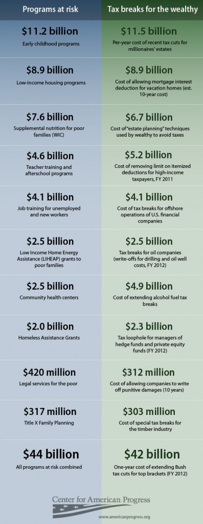
We posted it on Tuesday, February 22. At first, it gathered good traffic, but nothing prenomenal. But a couple weeks later, someone called “greywolf359” posted it on a Daily Kos diary with the headline “The Must See Chart (This is What Class War Looks Like).” That post sparked 133 comments and was “liked” on Facebook more than 11,000 times and tweeted more than a thousand times. That same day, someone spotted the DailyKos post and re-posted the graphic on posterous.com with the same headline. This post was the one that really exploded: it was viewed more than 1.1 million times, generated nearly 500 comments, was tweeted 1,325 times, and was liked on Facebook 104,000 times. Two days later, Andrew Sullivan at the Atlantic made it his “Chart of the Day,” adding his short note: “You don’t have to be a flaming Marxist to see that there’s something askew here.” All this buzz drove traffic back to our original post, generating more than 200,000 page views, making it the single most popular item on our web site for 2011.
In the end, this little graphic that I only spent a couple hours on was viewed by millions of people, sparked debates and arguments across the web, and, most importantly, advanced our argument to a wide audience. This graphic hit the web long before the start of the Occupy movement and the 99% protests; it attempted to re-focus the public debate from a narrow focus on budget cuts to a bigger question of national priorities. We wanted to show that it wasn’t just about cutting spending, but also about reconsidering tax breaks that benefited the wealthy.
A cocktail of chaos and boredom fuels the Internet; it’s hard to foresee what will spread exponentially. Most often, stuff that goes viral does so by luck more than by design. That said, a few things helped us with this graphic that can inform designers.
First, the graphic was simple. We showed a lot less information than the client originally wanted. We also edited all the text down to the most minimal labels. The result made this easily skimmable; a chart you could read and understand within a minute.
Second, a clear message drove the design: our argument was that the proposed GOP budget cuts were unfair choices when weighed existing existing tax breaks. Each line showed a choice available to lawmakers when they considered a new budget: safety-net programs that benefit large groups of people or tax breaks that help the richest Americans. We hoped the comparisons would alarm and infuriate people, and, by all the evidence, it looks like they did.
Third, the graphic was credible. This wasn’t a piece of political propaganda. Every number was sourced and verified: we used no “fuzzy math” or statistical trickery to build this infographic. People could — and did — disagree with our take on the numbers, what they meant, and whether or not our arguments are valid, but we wanted the facts to be irrefutable.
The infographic didn’t move. It had no animated rollovers. It didn’t even have any graphics, other than some color and a few lines. It had good content and a design that didn’t get in the way. And that, as much any thing else, is a formula for a viral hit.