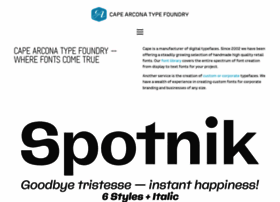
Cape-arcona - cape-arcona.com - Cape Arcona Type Foundry
General Information:
Latest News:
CA Oskar at Traumzeit Festival Duisburg/Germany 23 Jun 2013 | 05:06 pm
CA Oskar typeface was used for the Traumzeit music festival in Duisburg/Germany. The 2 square kilometer big festival place was covered with posters, billboards, prints, flyers, flags, information boot...
New stamp-font CA POSTAL 23 Apr 2013 | 12:30 pm
We know what you think: Why the hell does the world need another stamp-font? The answer is: Because CA Postal looks better than it’s anchestors. This is first because of it’s handsome futura-like appe...
The all new CA Viva Las Vegas 16 Apr 2013 | 01:57 pm
The all new CA Viva Las Vegas! Our beloved light bulb typeface inspired by signage of concert halls of the 70s when Elvis was playing in Las Vegas underwent a big remake. It now features a full lowerc...
Capes 10th Anniversary: CA Cula – 50% off 2 Dec 2012 | 03:59 am
CA Cula is somehow a kind of CA BND version 2. It started from the same basis, but received funky ink traps and the letterforms are more open. This makes it a bit more friendly to read and gives the …
Capes 10th Anniversary: CA Cape Rock – 50% off 1 Dec 2012 | 03:59 am
We really don’t understand, why CA Cape Rock didn’t become an instant bestseller. It’s such a cute font, with so many fancy ligatures. Come on – have a second look. Created with a fat Clarendon in mi...
Capes 10th Anniversary: CA Normal Serif – 50% off 30 Nov 2012 | 03:59 am
We knew that CA Normal Serif wouldn’t become an instant bestseller, as slab serifs are a bit out of fashion at the moment. But fashions come and go and we strongly believe that one day the pendulum wi...
Capes 10th Anniversary: CA Aires Pro – 50% off 29 Nov 2012 | 03:59 am
CA Aires turned out to be our most popular free font (now only rivaled by Cula Light) and after requests for a proper font, the success-story continued. So today we offer you one of our most successfu...
Capes 10th Anniversary: CA Normal Sans – 50% off 28 Nov 2012 | 03:59 am
CA Normal had it’s debut in january 2010 during a presentation at the tgm in Munich. It originally started with the idea of a cleaned-up version of CA Aires. So the proportions of the upper cases are ...
Capes 10th Anniversary: CA No Dr. – 50% off 27 Nov 2012 | 03:59 am
This is a really an early one. Maybe even one of the very first fonts on Cape Arcona. It’s first design was developed for the Beast magazine. We were totally convoked of having hit a goldmine, but it...
Cape Arcona Type Foundry – 10th Anniversary: CA Spy Royal 50% off 26 Nov 2012 | 03:59 am
10 years of type, 10 years of sunglasses, 10 years of wigs… Happy birthday to us! How long are 10 years? For a relationship it’s long, for a business it’s short. Cape Arcona Type Foundry is kind of b...