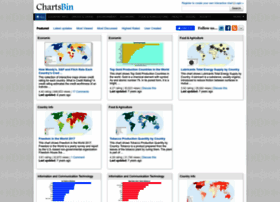
Chartsbin - chartsbin.com - ChartsBin's Latest updates

General Information:
Latest News:
Global Peace Index - 2012 13 Jun 2012 | 12:03 am
(Click above image to see an interactive chart/map) This map shows the Global Peace Index (GPI) rankings for the 158 countries around the world in indicators covering crime, terrorism, government, de...
Global Peace Index - 2012 13 Jun 2012 | 12:03 am
(Click above image to see an interactive chart/map) This map shows the Global Peace Index (GPI) rankings for the 158 countries around the world in indicators covering crime, terrorism, government, de...
How Moody's, S&P and Fitch Rate Each Country's Credit Rating 17 Jan 2012 | 03:31 am
(Click above image to see an interactive chart/map) This collection of interactive maps shows credit rating for each country. What is Credit Rating? A credit rating estimates the credit worthiness ...
How Moody's, S&P and Fitch Rate Each Country's Credit Rating 16 Jan 2012 | 10:31 pm
(Click above image to see an interactive chart/map) This collection of interactive maps shows credit rating for each country. What is Credit Rating? A credit rating estimates the credit worthiness ...
Gender Inequality Index 9 Dec 2011 | 05:07 am
(Click above image to see an interactive chart/map) The Gender Inequality Index (GII) reflects women’s disadvantage in three dimensions—reproductive health, empowerment and the labour market—for as m...
Gender Inequality Index 9 Dec 2011 | 12:07 am
(Click above image to see an interactive chart/map) The Gender Inequality Index (GII) reflects women’s disadvantage in three dimensions—reproductive health, empowerment and the labour market—for as m...
Alternative and Nuclear Energy (Percentage of Total Energy Use) 16 Nov 2011 | 04:09 pm
(Click above image to see an interactive chart/map) This map shows clean energy, expressed as a percentage of total energy use. Clean energy is noncarbohydrate energy that does not produce carbon di...
Alternative and Nuclear Energy (Percentage of Total Energy Use) 16 Nov 2011 | 07:09 am
(Click above image to see an interactive chart/map) This map shows clean energy, expressed as a percentage of total energy use. Clean energy is noncarbohydrate energy that does not produce carbon di...
Percentage of Insufficiently Active Population 8 Nov 2011 | 05:49 pm
(Click above image to see an interactive chart/map) This map shows percentage of defined population(aged 15 or above; age-standardized estimate) attaining less than 5 times 30 minutes of moderate act...
Percentage of Insufficiently Active Population 8 Nov 2011 | 12:49 pm
(Click above image to see an interactive chart/map) This map shows percentage of defined population(aged 15 or above; age-standardized estimate) attaining less than 5 times 30 minutes of moderate act...

